Concept
Where search could head
This is a concept, not a shipped feature. It looks at where WorldCat Discovery’s results page could go when someone types a question the way they’d ask it out loud, instead of a string of keywords. It builds on the linked data knowledge card and carries it into a page that shows how the question was read.
Everything here is sample data. The AI behavior is illustrated, not live, and the books are real titles picked so the examples feel believable.


Things to try
- Open See what was added in the bar to see how the question was read and what was added.
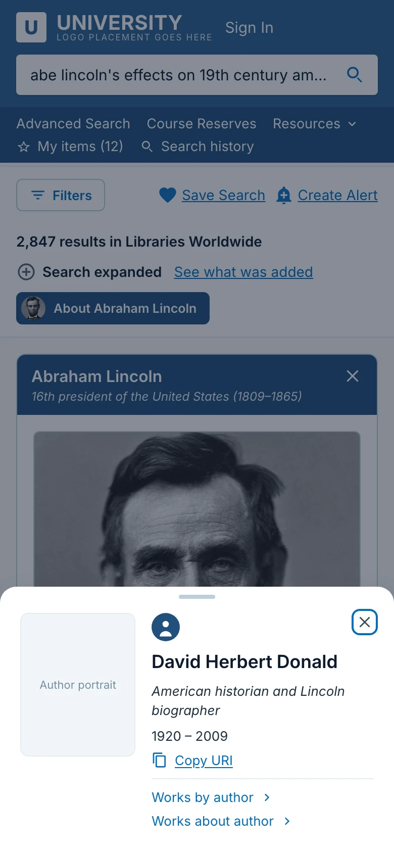
- Hover or focus an author name to see their details.
- Open Details on a result.
- Pick a question under Other users have asked to run it as a new search.
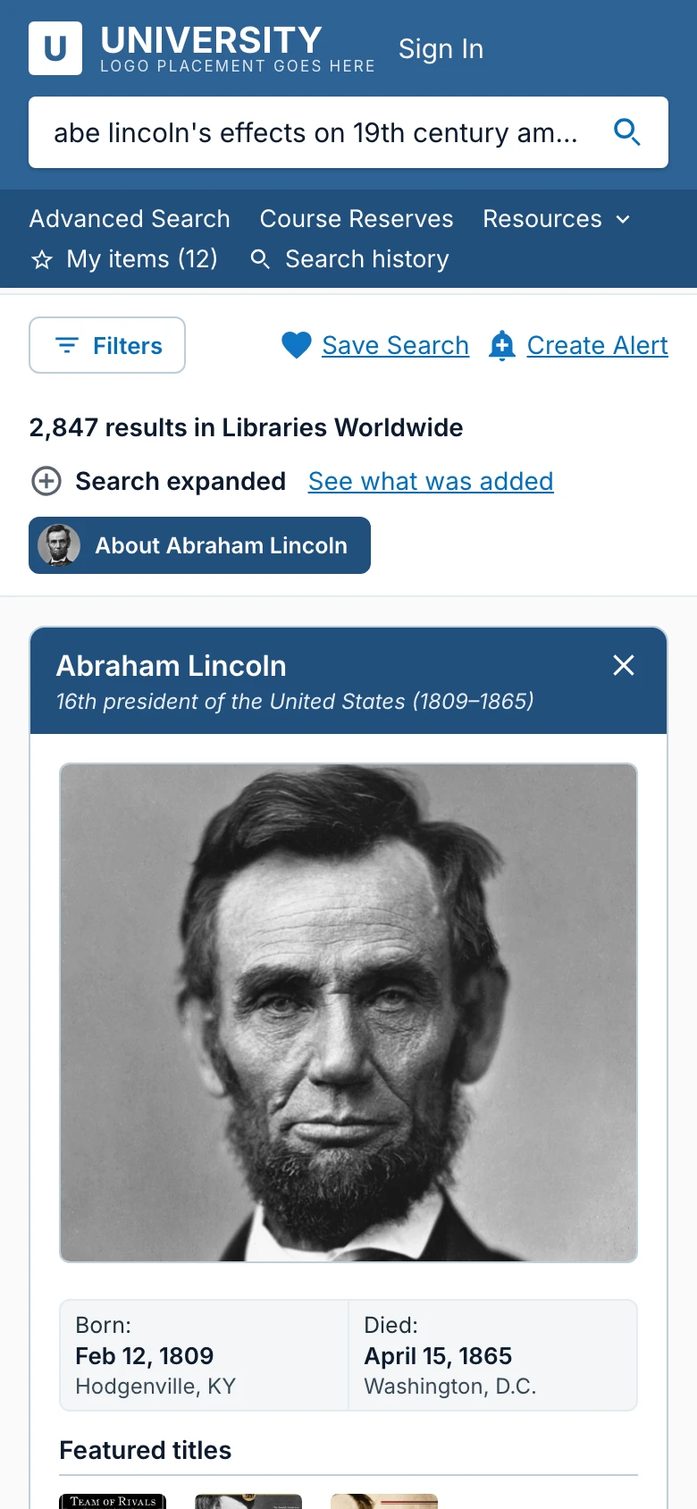
- In the knowledge panel, choose Civil War under Topics of interest and the panel switches to the American Civil War.
- Choose Illinois, then the question about Chicago, and the panel switches to Chicago.
- Close the panel with its X, then bring it back with the About Abraham Lincoln button.
The problem:
A question is not a keyword
People often type a question instead of keywords: “abe lincoln’s effects on 19th century america” rather than “Lincoln AND impact”. A keyword results page hands back a list. It doesn’t tell you how it read the question, what it added for you, or how the results connect to the different parts of what you asked.
For librarians, that’s a trust problem. If software rewrites a search, they need to see what it changed and be able to undo it.
The concept:
One page that answers, explains and leads on
The results page answers the question four ways, and shows its work.
- Best matches. The two records that answer the question most directly, right at the top.
- Topics inside your question. The question is split into sub-topics, with results grouped under each and a way to see more of any one.
- Other users have asked. Related questions, and each one runs as a new search.
- A knowledge panel that follows the subject. This is the linked data card, now changing with the search: Abraham Lincoln, then the American Civil War, then Chicago, with the same structure every time.
- See what was added. One notice in the results bar opens a single explanation: how AI restructured the question, which related and translated terms were added, and a way to run the search without them.
The flow:
From a question to a next step
You ask once, then you can understand, explore or act without leaving the page. Every path either ends in an action on a record or loops back to a new set of results.
Decisions:
What the details are doing
One notice, not two.
The first design had separate “AI-assisted” and “Search expanded” notices, each with its own dialog. Together they crowded the results bar, so they became one notice and one dialog. The dialog still labels the AI step, so the page never hides that AI changed the search.
Controls sit next to what they act on.
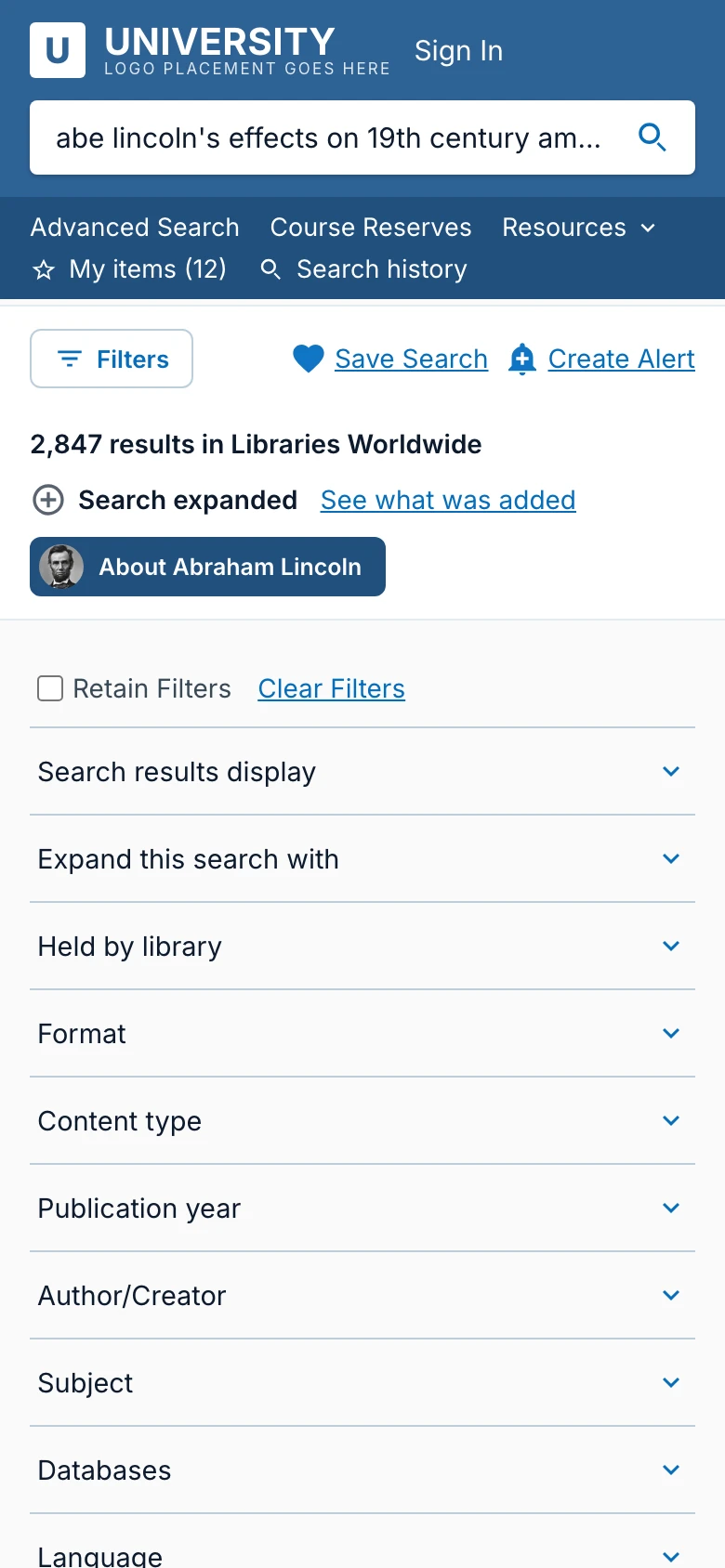
Retain and Clear Filters moved out of the results bar to the top of the filter column, right above the filters they affect. Save Search and Create Alert stayed in the bar because they apply to the whole search.
An explanation in three levels.
The dialog starts with the question exactly as typed, then gives one section for each change: the AI breakdown first, then the added terms, with the term groups inside. If a library replaces an outdated subject heading, the dialog shows the library’s alternate heading instead.
A results card with three zones.
What the work is (text), what you can do with it (actions), and where it is (availability). Details open right under their own toggle, never somewhere else on the card.
The panel follows the subject, but keeps its shape.
The image, the facts callout, featured titles, related people and topics stay in the same places whether the panel is about a person, an event or a place. That keeps it familiar as the content changes.
Closing is reversible.
Closing the knowledge panel leaves a small “About …” button in the results bar so you can bring it back.
Explored:
What didn’t make it
- Showing Retain and Clear Filters only once filters are applied, in a row of filter chips above the results. It made the area above the results feel heavy.
- Moving “Other users have asked” below the topics so the topics would read as the next step. It buried the questions.
- A compact, one-line list of those questions. It was weaker than the cards.
- Moving Save Search and Create Alert into the filter column. They read like stray links, and they aren’t filters.
Accessibility and responsive:
Shown on desktop, designed for all three
The prototype here is the desktop layout, but the concept was designed for tablet and phone too. On smaller screens the filters move into a drawer, the knowledge panel opens above the results, and author details open as a bottom sheet.
Dialogs keep keyboard focus inside them and return it when they close, and Escape closes the top layer first. The result count is announced as it changes, results are marked busy while a new search runs, and every animation is removed for people who ask for reduced motion.