Software Homepages
Elevating a crucial feature
CAS SciFinder helps scientists search patent and non‑patent literature to solve research problems faster. That covers substance properties, reaction scheme data, methods, and protocols.
I designed, iterated on, and tested the homepage redesign, partnering with the design lead, product manager, product owners, and IT to launch it.
The old homepage
The old homepage split search into two disconnected pieces: a generic search field and a sidebar listing every specialized tool as its own link.
Users had to already know a tool existed before they’d think to look in the sidebar for it.
- CAS Lexicon, Retrosynthesis, and sequence searching sat buried a few clicks deep and saw very little use
- Testing showed most users had no idea these tools were part of the product at all
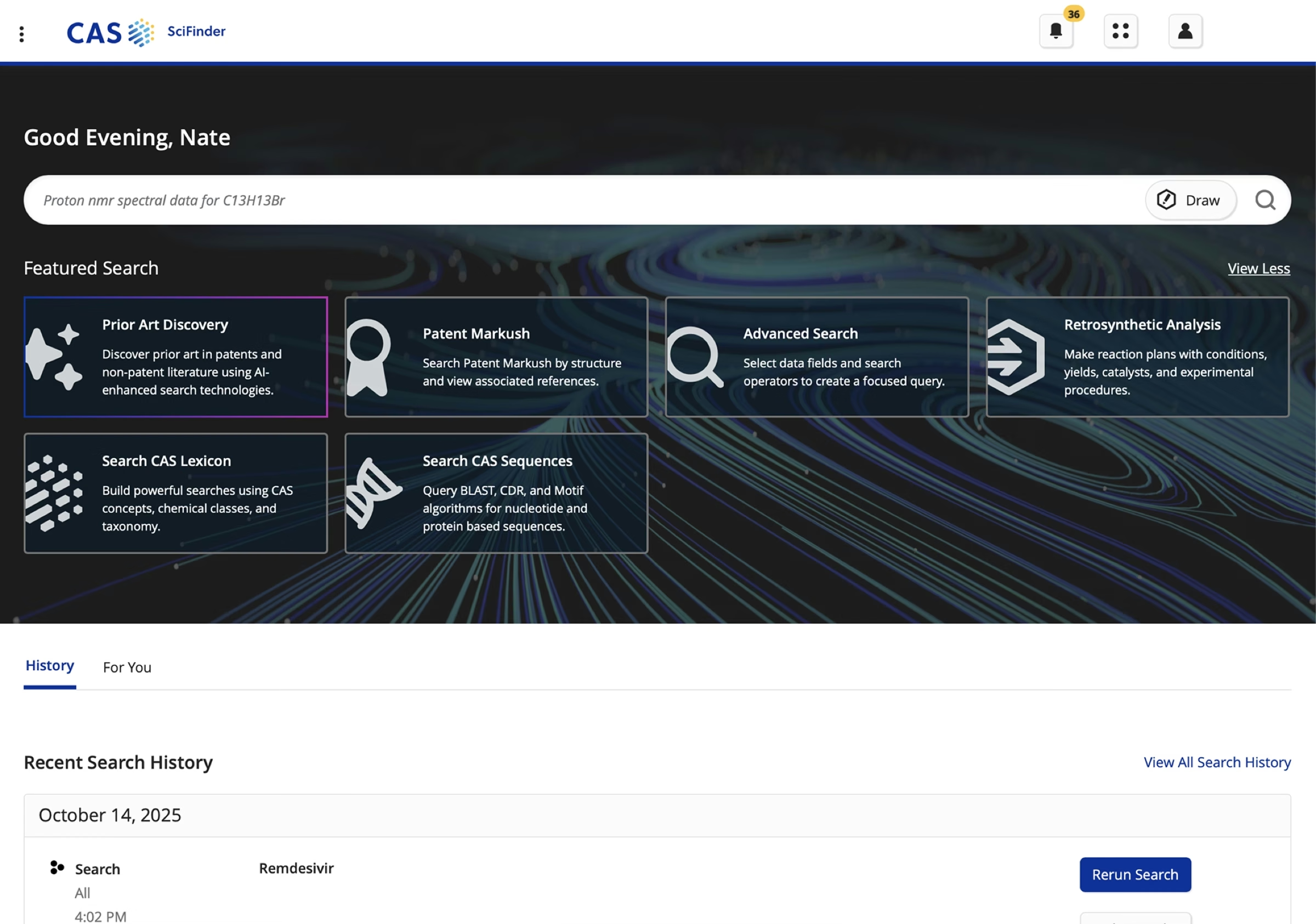
 Old homepage
SciFinder 2025
Old homepage
SciFinder 2025
Drag to compare the old homepage with SciFinder today.
The process
My goal was to help customers find information as fast as possible by showcasing every feature and option available to them.
I iterated with hand-drawn sketches, benchmarked competitors like ChemSpider, Google, and Web of Science, then built a prototype with the design team.
The first sketch won. It let me split search into categories, so the search bar could adapt to what someone was looking for. I kept recent searches right where they were, since people use them constantly and moving them wouldn’t have helped anyone.
I also pushed back on keeping the old side navigation. Users often told us it was confusing, and every new feature CAS added meant another link stacked onto it. That would only have gotten worse.
- Coordinated two qualitative research studies (n=12 each), followed by a satisfaction survey of existing users (n=368) using in-product feedback
- Worked with the UX manager to introduce key feature boxes below the main search bar, surfacing niche search capabilities the primary search couldn’t handle
Scroll to see more →
Flowchart structure, described as a nested list:
- Homepage
- Saved/Alerts → Saved Info
- History → History Page
- Account → ID & Access
- Search (fed by Top Nav Bar: All, Substances, Reactions, References, Suppliers)
- Search → Category → Search Info
- Search → Category → CAS Draw → Drawing Tool → Draw Results
- Callout Info → Callout Page
Low-fidelity wireframes
Homepage / Option A
Homepage / Option B
Homepage / Option C
Homepage / Option D
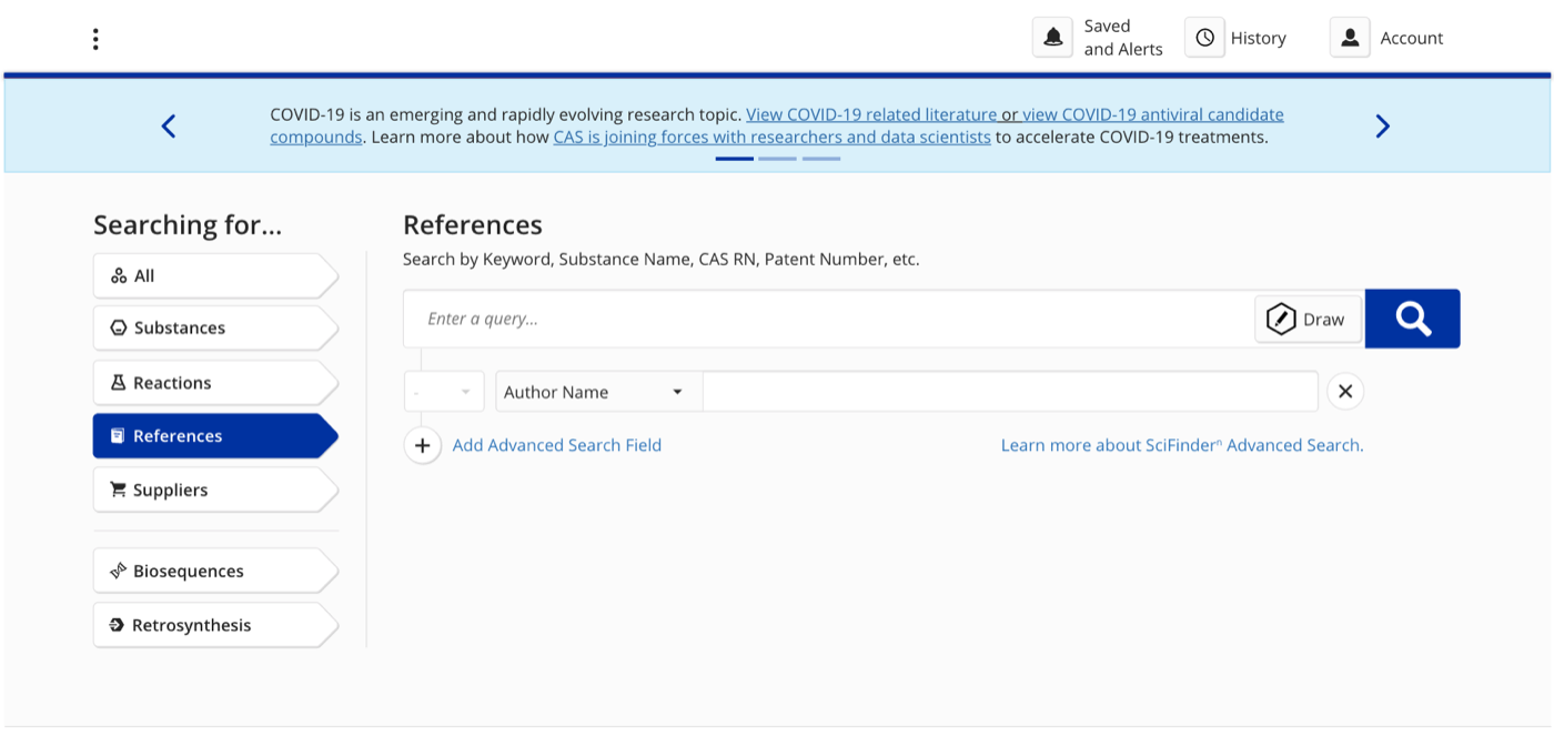
The new
Making the key feature boxes always present, not tied to a specific search type, made niche capabilities discoverable and drove a 503% increase in usage of features like CAS Lexicon.
The same approach carried over to Formulus and Analytical Methods, lifting engagement with their Formulation Designer and Method Browser features too.
- Alerts in the top header saw heavier use, as scientists checked them to stay current
- Very few users used “Save”, so a planned update replaces it with saving directly into project files
- A “trending” feature tested in the same spot raised privacy concerns (searches can include company IP) and was scrapped
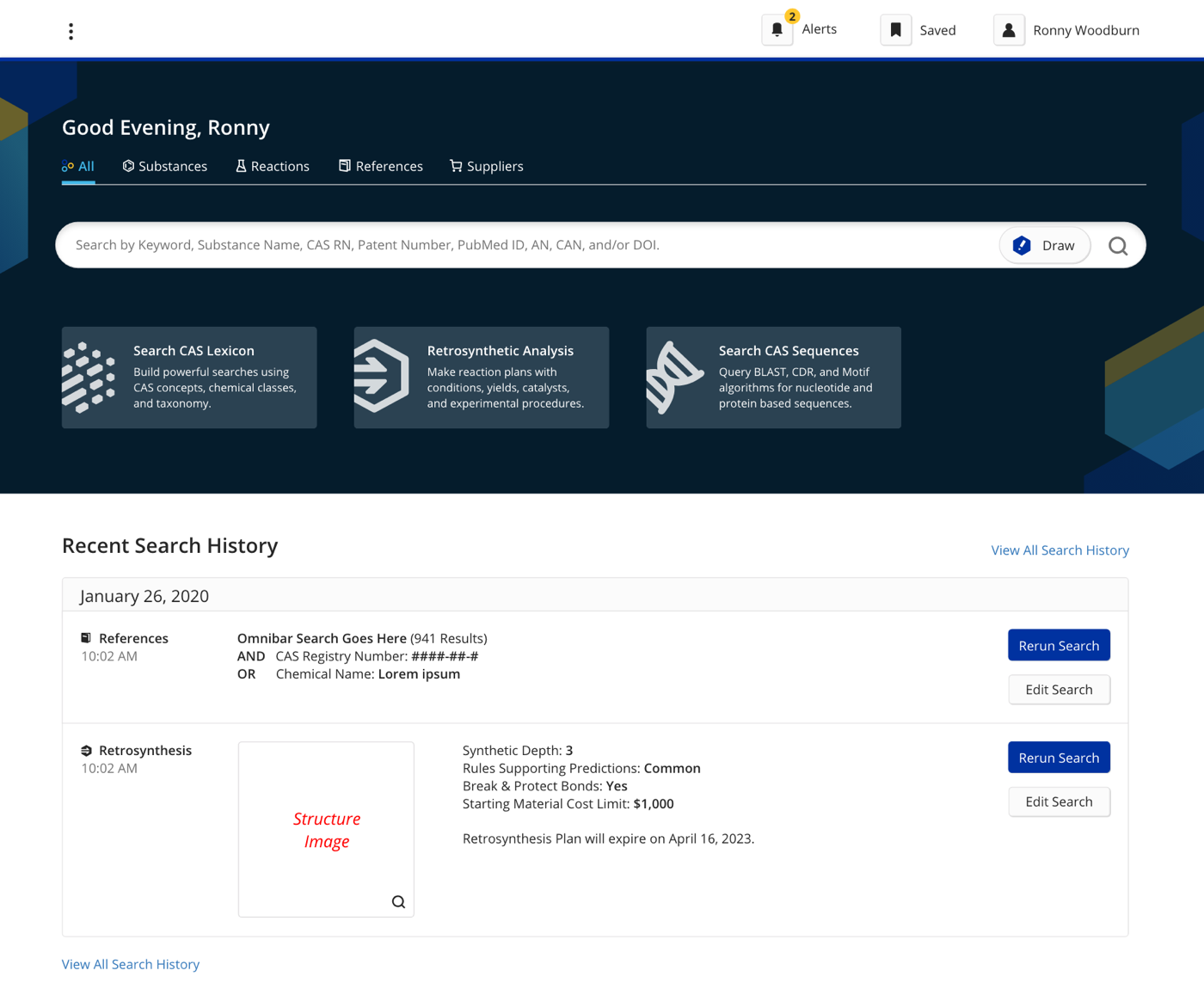
The impact showed up quickly in the numbers:
+503%
Increase in usage of value drivers: CAS Lexicon, Retrosynthesis, and sequence searching
+28%
Increase in result content: substances, reactions, references, and patents
Creating a new branding system
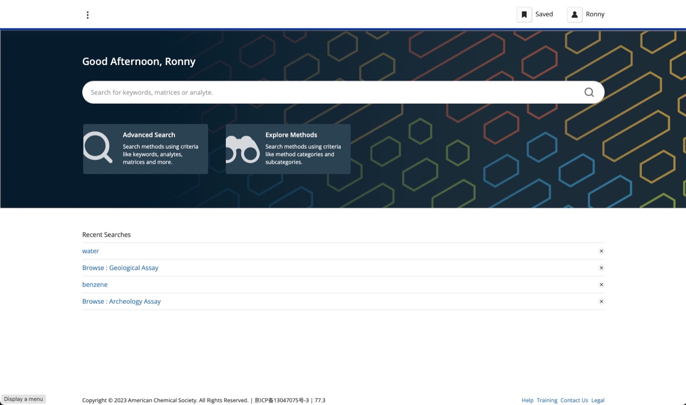
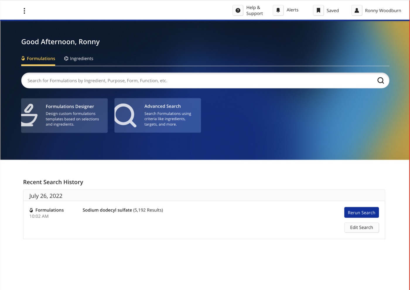
After the homepage’s success, I was tasked with designing homepages for CAS’s other software: Formulus, Analytical Methods, and a new product still in production.
I created the backgrounds in Adobe Illustrator, each speaking to the primary type of chemist who uses that product. Introducing color into a largely colorless product also helped build excitement around using it. Every design decision here was mine.
The background images have been updated since, but the homepage layout I designed has been fully adopted.
Shaping CAS BioFinder
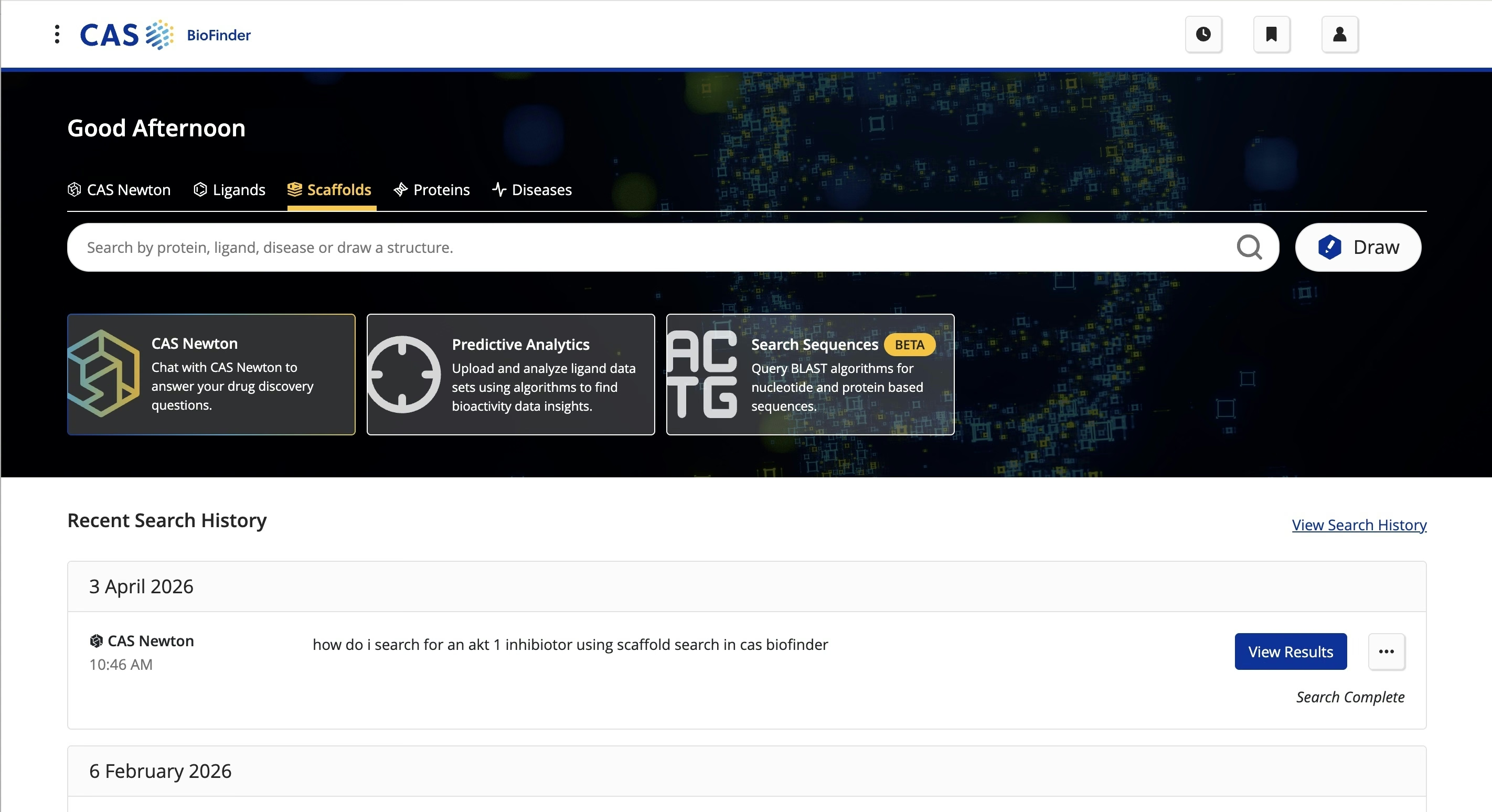
I wasn’t the designer on CAS BioFinder, but decisions I made on SciFinder, Formulus, and the multicomponent display helped shape its UX and UI.
Its homepage follows the structure I built for SciFinder: an illustrated hero, a single search bar, and the key feature boxes always visible beneath it.
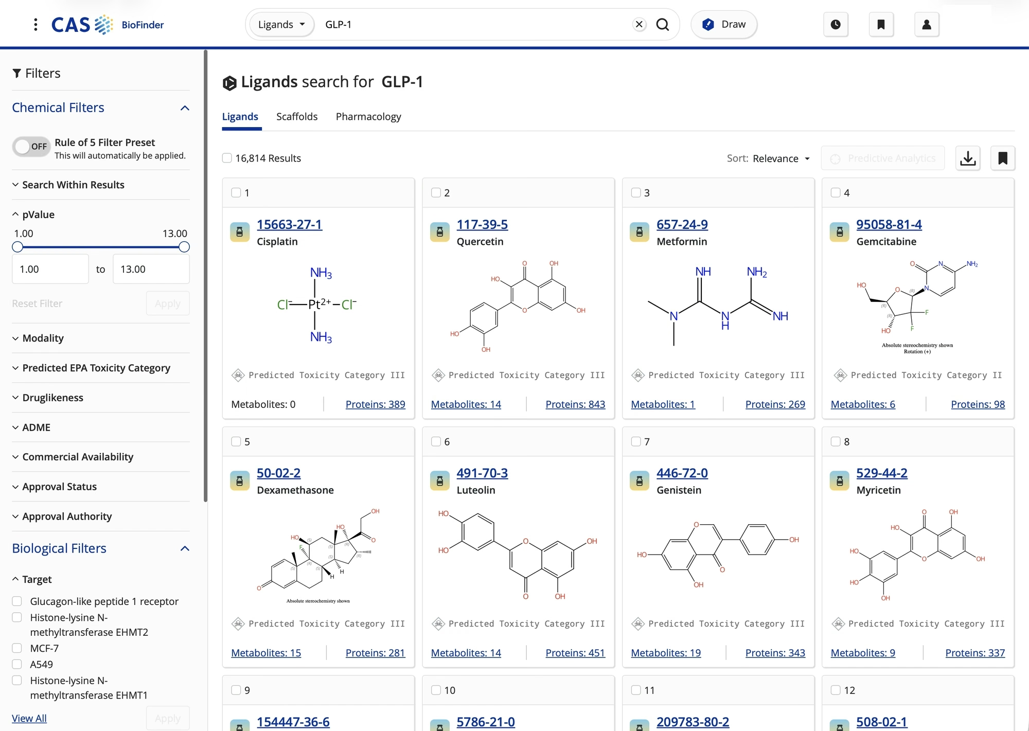
- Results run in horizontal rows so more fits above the fold. I helped with that decision in a small capacity, and how the rows are formatted draws on my multicomponent work and the Formulus UI changes
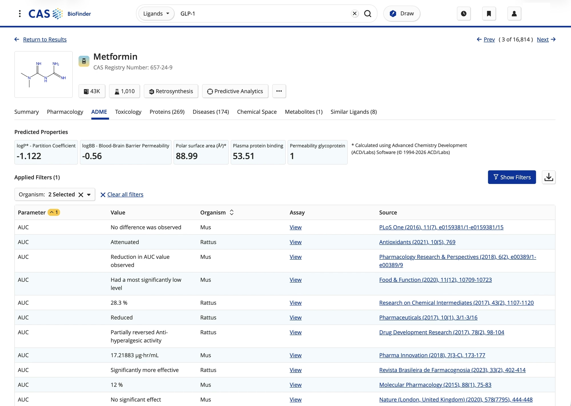
- The detail pages use tabbed navigation, the same pattern used across the software
- The quick callout cards first appeared in my All Page designs for SciFinder
All Page
All that we need
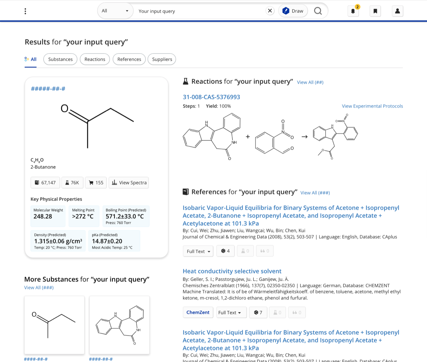
The all page search result brought together a query’s top results across every category SciFinder offers: substances, reactions, references, and suppliers.
Working with the creative director, I researched its pain points, prototyped the new look and interactions, and designed a page that functions more like a proper search engine.
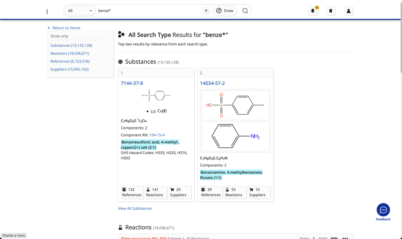
The old
Much like the homepages, the side navigation was a huge pain point. Users had to constantly switch between the left and right sides of the page, one category at a time.
- Only 1-2 top results showed at a time, especially for substances and references
- Many users found the page unhelpful and ignored it entirely
The process
The creative director and I iterated extensively to get the all page’s look, feel, and usability right.
Simple in-house testing with low-fidelity prototypes helped sift out confusing designs and workflows before anything moved to digital.
I was instrumental in deciding the layout and how everything could interact and breathe on one page. The old page stacked everything, and users wanted to see more at once, so that’s what I designed for.
I landed on the fourth layout. A callout on the left carries the top substance with the highest hierarchy and a quick overview. Below it, a list of other substances that could fit the query works a bit like a “you might like” list. That left column gave the right side room for reactions, which need a more horizontal treatment, and references, which are dense and need space to breathe.
Low-fidelity wireframes
All Page / Option A: Chart
All Page / Option B: Callouts
All Page / Option C: List
All Page / Desktop layout
The new
The new design works with the intelligence of a proper search engine, surfacing the most useful results first.
- Left side: the primary substance result, with key information in CTA buttons that jump straight to that detail on the results page
- Below it: the next-best results, so users can quickly scan what’s relevant
- Right side: the top reaction result leads, now paired with a visual aid that wasn’t there before
- Below that: reference results with title and key details up front, with enough information to be useful without overwhelming the page
 Old all page
New all page
Old all page
New all page
Drag to compare the old all page with the new all page.
Multicomponent Structures
Changing the structure
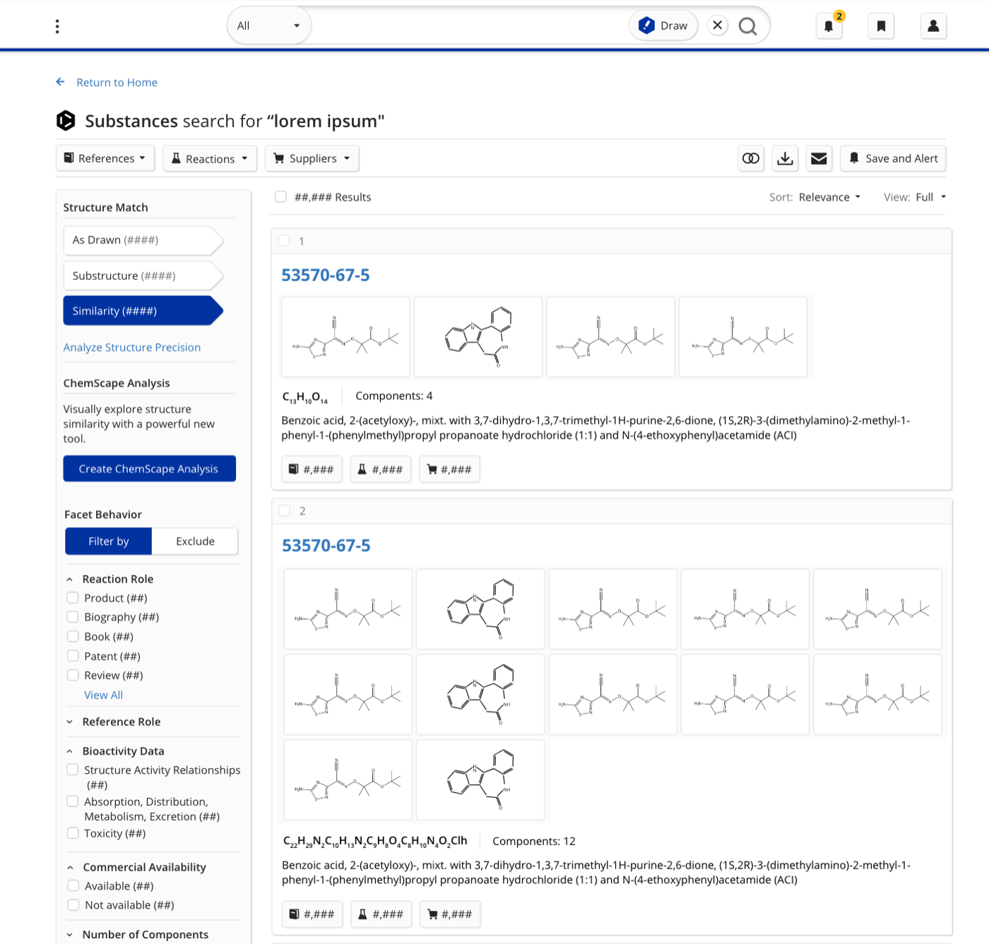
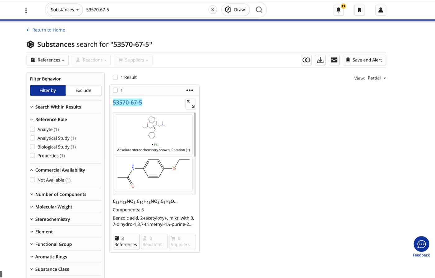
SciFinder lets users search for substances with multiple chemical components, which used to be stacked vertically, one below another.
Users needed to see multiple components at once, and the vertical stack made them scroll inside each result. A horizontal layout had never been done in SciFinder, and there was real hesitation. The fear was losing the grid view people were used to. Research showed that seeing every component on the page mattered more than that, so I pushed for it and moved the display horizontally across the full width. Users loved it in testing.
This wasn’t a high-priority page, but I felt strongly it belonged in the product. With tight time and resources, I skipped the usual low-fidelity rounds and worked in hi-fi sketches, refining them as I went.
 Old layout
New layout
Old layout
New layout
Drag to compare the old layout with the new layout.