Formulations
The brief
In Formulus, users can search for formulations (mixtures), or break them down further and search for the ingredients within them.
The results needed to show a lot of the top information a user may need, while still letting them navigate many results quickly if necessary.
I started from the research already done on the results pages and kept everything that worked about the old design’s usability. Almost all of the key decisions on the redesign were mine.
The process
Formulus is built for a very specific kind of chemist, so I worked with feedback groups of a small number of core users to learn what mattered most in the layout.
The creative director and I went through many iterations, and simple in-house testing with low-fidelity prototypes helped sift out confusing or hard-to-understand designs and workflows before anything moved to digital.
For formulations, the sketch I worked from moved to a two-column grid of condensed results so more of them fit on screen at once. Ingredients was a restructure of what was already there rather than a new layout. I explored two ways to do it: sharpening the font hierarchy, and a more experimental version that segmented the information into categories.
Low-fidelity wireframes
Ingredients / Font hierarchy
Ingredients / Categories
Formulations / Four-up
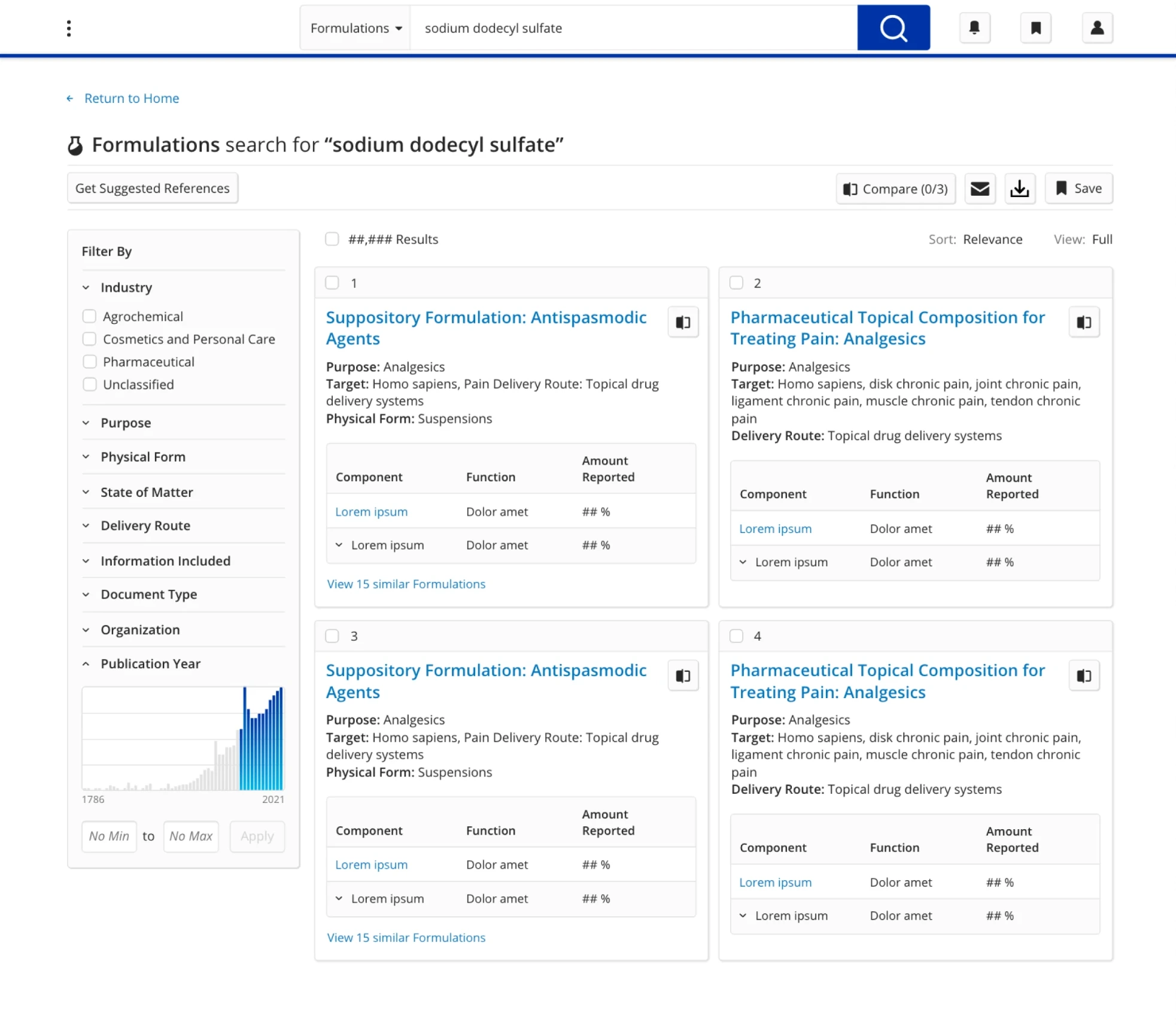
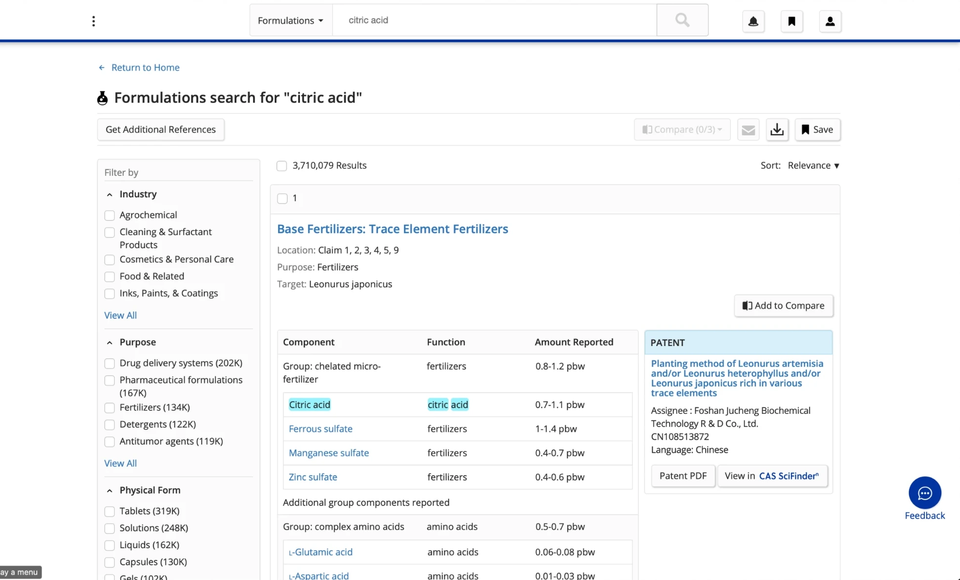
The old formulations
Only one formulation fit above the fold, and that was a big pain point for users.
The research showed that the old results page carried a lot of unnecessary data, especially in the charts.
The information in the charts, the width of the charts themselves, and the patent information (which also had unnecessary detail) made each individual result incredibly long.
- Users felt unable to navigate the multitude of results quickly
- Many didn’t know there were multiple results on a page
 Old formulations
New formulations
Old formulations
New formulations
Drag to compare the old formulations page with the new one.
The new formulations
A two-column condensed view shows up to four formulations above the fold, up from one.
That made the page easier to navigate while delivering the same quantity of information. I removed auxiliary information like the source documentation, which was largely unnecessary.
Ingredients
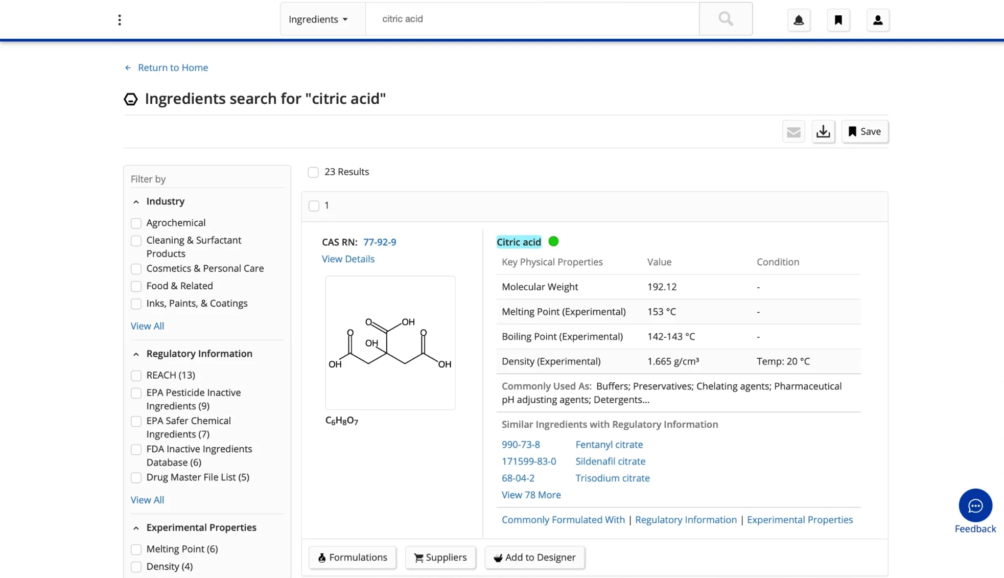
The old ingredients
Like the formulations results page, the ingredients page showed too much information, though slightly less.
The biggest pain point was the hierarchy of the information. Many users were left confused by it rather than helped.
 Old ingredients
New ingredients
Old ingredients
New ingredients
Drag to compare the old ingredients page with the new one.
The new ingredients
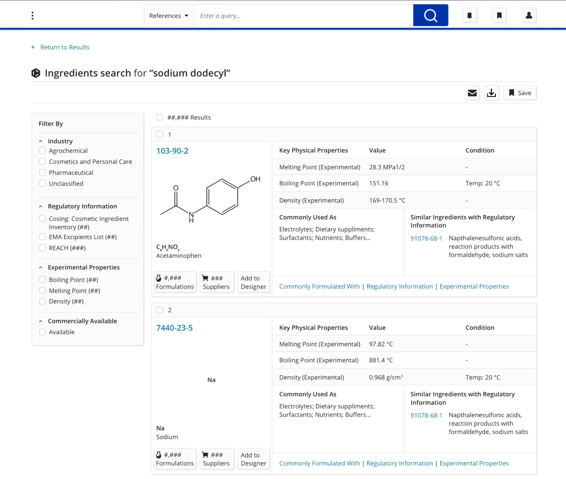
I restructured the existing page rather than replacing it. Larger molecular images let users see more important structural details, and fewer containers in the results column saved space.
I kept the key physical properties for each ingredient, but reworked the “used as” and “similar ingredients” data so the display is more legible and consistent with other products in the portfolio.
Users engaged more with the page’s elements, which sped up their process and improved their workflows:
+19%
Increase in user engagement with the ingredients results page, over a few months after launch