Method detail
The brief
CAS Analytical Methods lets scientists search for methods and protocols by analyte, matrix, and other data points, then use what they find like a cookbook for running experiments in the lab.
Working with the product manager and the UX manager, I set out to fix the product’s consistency and usability problems. Most of the key decisions were mine, and I worked closely with my manager on how the materials and instructions are laid out on the detail page.
The research
The product has very little competition, so the usual competitive analysis had little to offer. I relied on customer interviews and on watching real usage in Fullstory instead.
- Users struggled to parse the tabular display and the continuous scrolling, which is hard on desktops, laptops, and tablets
- Several users scrolled up and down repeatedly to see the information they needed at the same time
- Users got real value from exporting a method to PDF, because labs often don’t allow computers for safety protocols and procedures, so the PDF is what they take into the lab
The process
Scientific research is a lot like usability research: a hypothesis is validated through repeated success. To fix the scrolling, I iterated on a two-column approach and built a prototype with accurate scientific information.
A qualitative study (n=15) showed that the overwhelming majority of users preferred seeing all the information about substances and apparatuses at the same time as the step-by-step “cookbook” instructions scientists replicate in the lab. It gave them the context for the experiment, and an easy-to-read PDF to download with no risk of harm in the lab.
During this work I also came up with query-term hit highlighting, which shows where in the method details a search term appears. It drastically increased how glanceable the method PDF is.
The old detail page
The old detail page ran very long and was hard for users to follow. They found it unorganized, and it slowed them down while they were running experiments.
Scientists needed something they could glance at and understand quickly. It works like a recipe: having to keep scrolling and go back and forth between things breaks the flow of the experiment, just as it would when cooking a meal.
The new detail page
More than 97% of users are on desktops, so I used the horizontal space to show all the reagents, materials, and substances in a method’s protocol at once.
For the step-by-step instructions, I brought over the two-column approach from Formulus with a two-thirds split, giving the instructions the greater space. That put more information in front of the user, and it brings the two products into line with each other. I worked closely with my manager on how the materials and instructions sit on the page.
I moved the source material to the bottom of the page. It is auxiliary information used to verify a method, so it doesn’t need to sit at the top.
Results page
The old results page
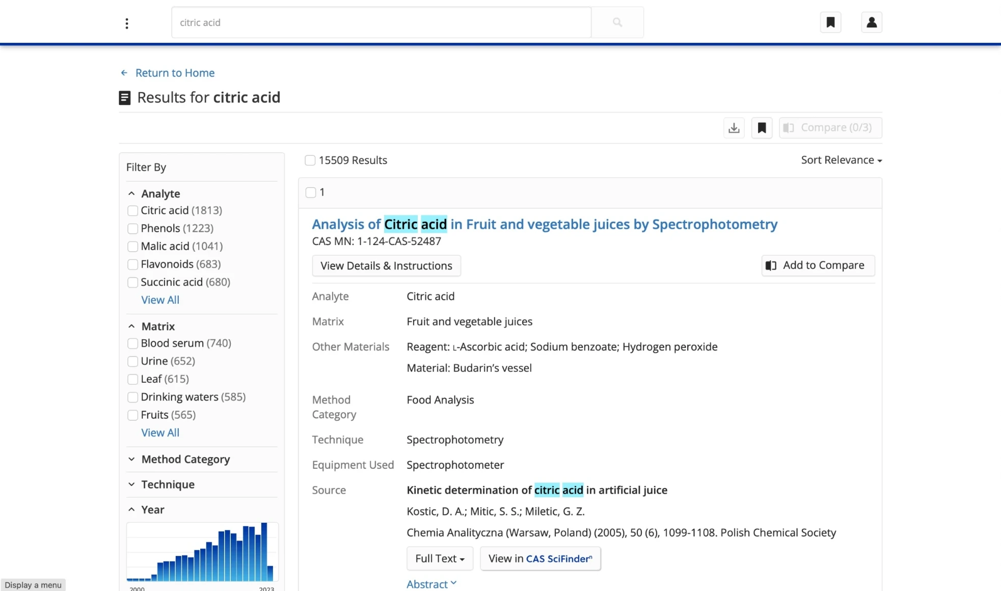
The old display used a larger font and more generous line spacing, which reduced how much information users saw at once.
That mattered because scientists need to see many results to judge which method works best for them.
To show more data, I tested changes with users through an in-product survey I built in Sprig. It showed that users wanted to see more options on the page, so they could scroll and see more in less time. They also wanted just the important information in each result, condensed so it is easier to glance at and read.
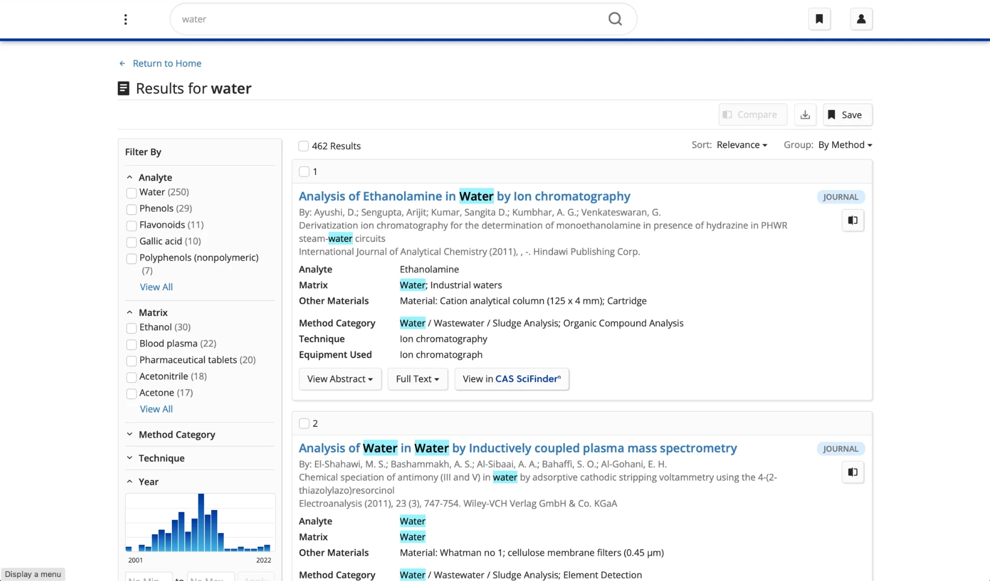
 Old results
New results
Old results
New results
Drag to compare the old results page with the new one.
The new results page
Reducing the font and line spacing and reorienting some auxiliary information let users see many results at once, so they could compare them and pick what works best for them.
Scrolling on a result set increased by 41% over roughly six months after launch, and it became easier to cross over to other products for information about a method’s source literature.
Users scrolled further through each result set, which is what they told me they wanted:
+41%
Increase in scrolling on a result set, over roughly six months after launch